
Eike König’s messages are bold, loud, and impossible to miss. As early as the 1990s, the graphic designer founded the creative collective HORT, which scored significant successes for clients such as the Bauhaus Dessau Foundation, Nike and Microsoft. One of the two current major projects has just been realized in Paris. König also teaches at the HfG Offenbach.
Which force propelled you into the field of free art?
A practical scholarship in 2013 at the Villa Massimo in Rome. Peter Zizka had submitted me, and so I was one of the first candidates for applied graphic design who could occupy the studio with the number 1 for a longer period of time. In order to work analog again, as I was trained to do over 30 years ago, I set up a kind of hand-printing shop for originals there. Hand-cut letters made of foam rubber served as printing stamps. A self-imposed set of rules – one paper and type size, Helvetica as a container for my statements or thoughts embodied through print – were designed to sharpen the focus by reducing the possibilities to explore the limits of the system. The content itself investigated language in its context and its interpretive spaces. The longer I explored it, the more possibilities emerged. What initially was intended to be a boundary turned out to be a solar system of its own, with more and more solar systems adjoining its edges. And since I am a curious creature who always seeks to tap into new potentials, I decided to invest a large part of my energy to further my artistic practice, while at the same time positioning myself in the art market, to which I was a stranger at the time.


Typography and pop art are hallmarks of your artistic expression. Where do you personally draw the line between art and design? Does this boundary mean anything to you at all?
For me, my artistic practice is a logical evolution of applied design. As a graphic designer, I have created visual communication systems tailored to the needs of my customers. Typography has always served as the foundation of my design work. The language of brands, be it consumer goods or cultural assets, are part of our language canon and serve the verbalisation of a promise. This is a compelling research field for me.
Obviously, the boundary between art and design is also a construed one. And as you may imagine, I am more of an amused critic of this construction. But I can also appreciate it for marketing reasons. After all, the different ‚disciplines‘ constantly cross-fertilise each other, if only to ensure the DNA pool won’t dry up. In fact, art breeds culture and, like an engine, drives a society. With this in mind, I find the impact of design on our society, its permanent presence in everyday life, our constant interaction with it, to be much bigger than that of art with its artificial elevation. So it is about time to acknowledge that and to please support it the same way. By that I mean support for design research, acceptance into the sacred feuilleton, and museum spaces for exhibition. Just kidding – but then, why not?
So in my practice, the boundary is not an issue, even though I am constantly aware of it. I operate both applied and free, with preference for the free, where I determine all the parameters of my work myself.


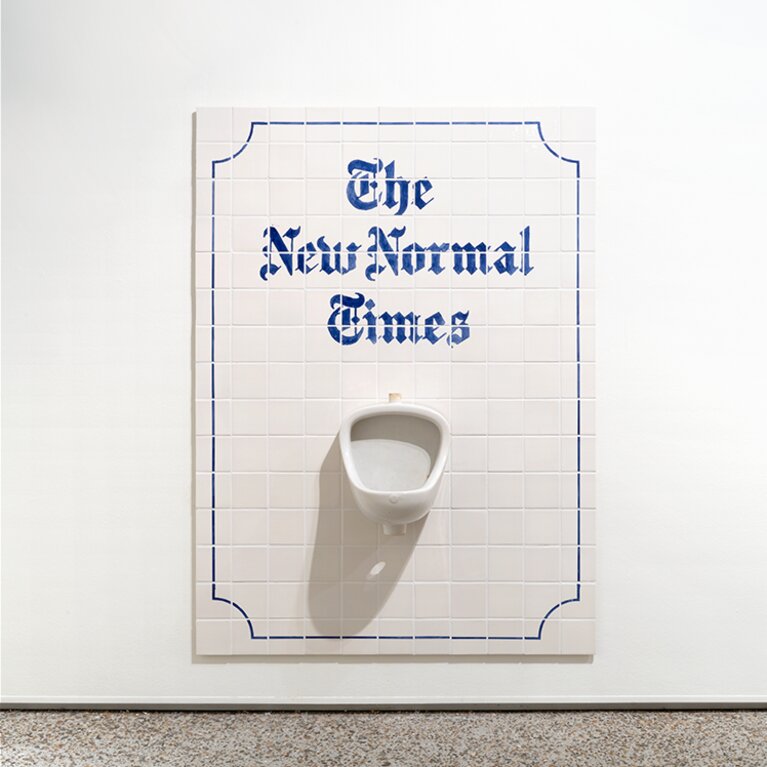
One of your more recent works is called »The New Normal Times.« How would you describe the »new«? What opportunity do you see in the new?
The work is not that NEW. The New York Times had asked me in March 2020, at the onset of the pandemic, if I might consider creating an artistic piece for their then-new section ART IN ISOLATION. At the time, TNYT already had published essays on the topic of THE NEW NORMAL, and I had already taken an interest in it. And so the idea of using the original newspaper logo and the letters it contained to typeset THE NEW NORMAL TIMES was the obvious choice. So simple yet so powerful for that very reason. For the missing letters A and L, I – and I’ll call myself an amateur professional now – simply pulled a trick. A lowercase e turned upside down becomes a, and when you cut away the offcoming diagonals from the k, you get an l. Here we go.

As it happens, there is no such thing as a NORMAL. It is a construction that can vary depending on the context. For me, the term has very negative connotations, as it does not include but rather seeks to divide. What is normal is not determined collectively but by those groups that position themselves above ‚normal‘. Those who have the power, so to speak. When we consider our everyday life, its processes, contents, routines etc. as ‚normal‘, then of course a global crisis like that already amounts to an earthquake with massive shifts. This is precisely where the opportunities lie to reflect on the individual elements and to renegotiate them. The personal, but also the social compass can be readjusted and a new (better?) ‚normal‘ can be established. In a few years we will know if this has actually taken hold.


The conversation with Eike König was first published in the mcbw MAG as part of mcbw 2022.
